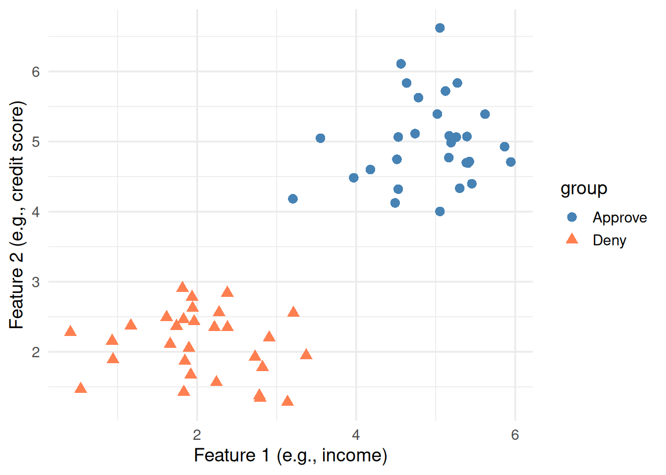
Imagine you have a bunch of data points that belong to two categories — say, “approve” vs “deny” for a loan application. Each point has two measurements (features). Can we draw a line that separates them?
Figure 1: Two groups of points. Can you draw a line to separate them?
You could probably draw a line through the gap by eye. But which line? There are infinitely many lines that separate these two groups.
2. Not Just Any Line — The Best Line
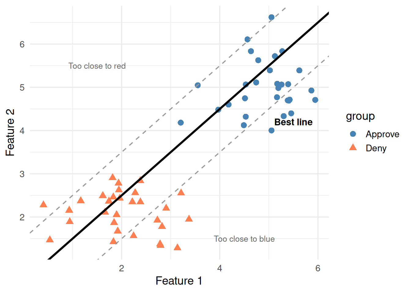
Here’s the key insight: some separating lines are better than others. A line that barely grazes the closest points is fragile. A line that sits right in the middle of the gap is robust.
ggplot(df, aes(x1, x2, color = group, shape = group)) +geom_point(size =3) +# Bad line — too close to bluegeom_abline(intercept =-0.5, slope =1, linetype ="dashed", color ="gray60") +# Bad line — too close to redgeom_abline(intercept =1.5, slope =1, linetype ="dashed", color ="gray60") +# Good line — right in the middlegeom_abline(intercept =0.5, slope =1, linewidth =1.2, color ="black") +scale_color_manual(values =c("steelblue", "coral")) +annotate("text", x =1.5, y =5.5, label ="Too close to red", color ="gray40", size =3.5) +annotate("text", x =4.5, y =1.5, label ="Too close to blue", color ="gray40", size =3.5) +annotate("text", x =5.5, y =4.2, label ="Best line", fontface ="bold", size =4) +theme_minimal(base_size =14) +labs(x ="Feature 1", y ="Feature 2")
Figure 2: Many lines separate the data, but which one is best?
The best line is the one with the maximum margin — the widest possible gap between the line and the nearest points on either side.
That’s literally what SVM does: find the line (or hyperplane) with the maximum margin.
3. What’s a Hyperplane?
Don’t let the word scare you. It’s just the generalization of a “line” to higher dimensions.
Dimensions
Separator
Math
2D
A line
\(w_1 x_1 + w_2 x_2 + b = 0\)
3D
A flat plane
\(w_1 x_1 + w_2 x_2 + w_3 x_3 + b = 0\)
nD
A hyperplane
\(\mathbf{w} \cdot \mathbf{x} + b = 0\)
The equation \(\mathbf{w} \cdot \mathbf{x} + b = 0\) defines the decision boundary. Let’s unpack every symbol.
4. Unpacking the Formula Piece by Piece
The Decision Boundary
\[\mathbf{w} \cdot \mathbf{x} + b = 0\]
Symbol
What it is
Plain English
\(\mathbf{x}\)
A data point
One observation — like (income, credit_score)
\(\mathbf{w}\)
Weight vector
Controls the tilt of the line
\(b\)
Bias (intercept)
Shifts the line up or down
\(\mathbf{w} \cdot \mathbf{x}\)
Dot product
\(w_1 x_1 + w_2 x_2 + \dots\) — a weighted sum
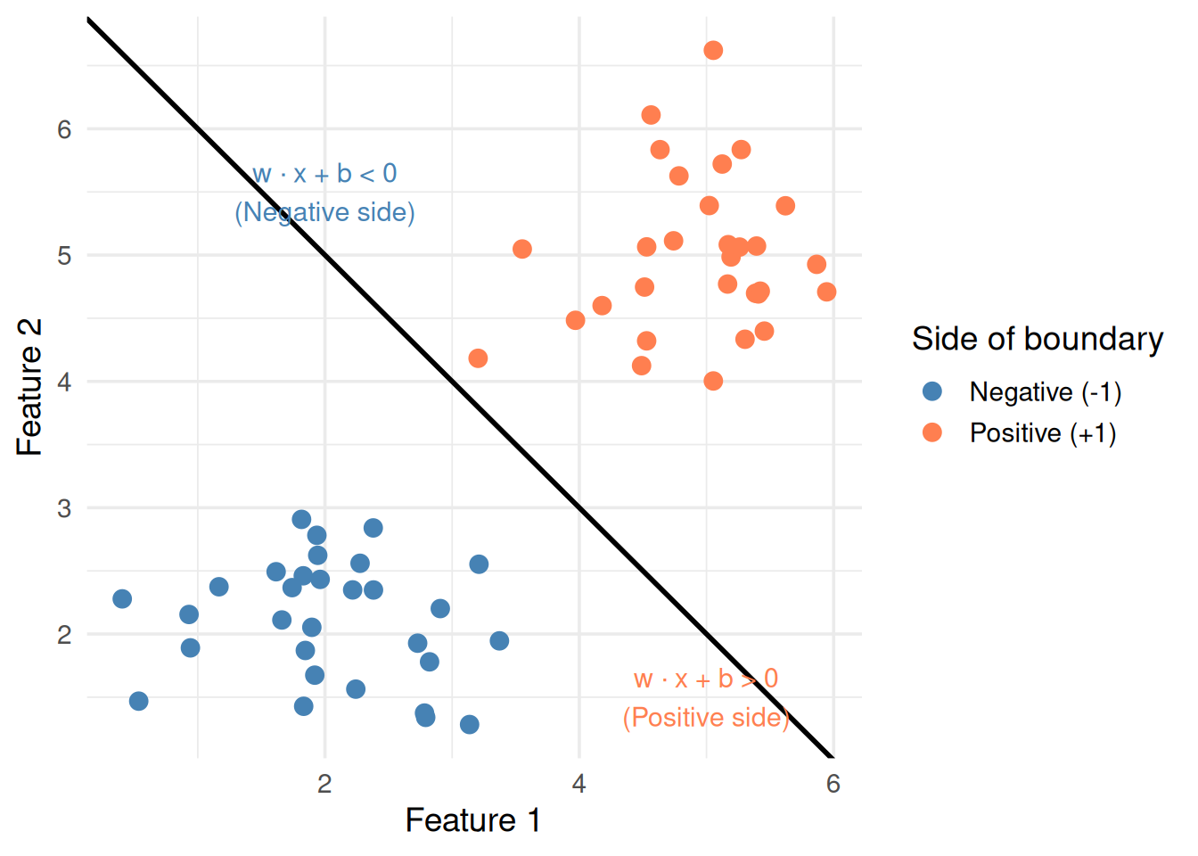
How it classifies a new point: plug in \(\mathbf{x}\), compute the value:
If \(\mathbf{w} \cdot \mathbf{x} + b > 0\) → class +1 (e.g., Approve)
If \(\mathbf{w} \cdot \mathbf{x} + b < 0\) → class -1 (e.g., Deny)
If \(\mathbf{w} \cdot \mathbf{x} + b = 0\) → exactly on the boundary
# Show which side of the line each point falls onw <-c(1, 1) # weight vectorb <--7# biasdf$decision_value <- w[1] * df$x1 + w[2] * df$x2 + bdf$side <-ifelse(df$decision_value >0, "Positive (+1)", "Negative (-1)")ggplot(df, aes(x1, x2, color = side)) +geom_point(size =3) +geom_abline(intercept =-b / w[2], slope =-w[1] / w[2], linewidth =1) +scale_color_manual(values =c("steelblue", "coral")) +annotate("text", x =2, y =5.5,label ="w · x + b < 0\n(Negative side)", color ="steelblue", size =4) +annotate("text", x =5, y =1.5,label ="w · x + b > 0\n(Positive side)", color ="coral", size =4) +theme_minimal(base_size =14) +labs(x ="Feature 1", y ="Feature 2", color ="Side of boundary")
Figure 3: Points on each side of the decision boundary get different signs
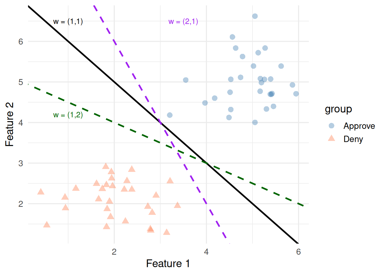
The Weight Vector Controls Direction
\(\mathbf{w}\) is perpendicular to the decision boundary. It points from the negative class toward the positive class.
Changing \(\mathbf{w}\)rotates the line
Changing \(b\)slides it parallel to itself
ggplot(df, aes(x1, x2, color = group, shape = group)) +geom_point(size =3, alpha =0.4) +# w = (1, 1): 45-degree linegeom_abline(intercept =7, slope =-1, linewidth =1, color ="black") +# w = (2, 1): steepergeom_abline(intercept =10, slope =-2, linewidth =1, color ="purple", linetype ="dashed") +# w = (1, 2): shallowergeom_abline(intercept =5, slope =-0.5, linewidth =1, color ="darkgreen", linetype ="dashed") +scale_color_manual(values =c("steelblue", "coral")) +annotate("text", x =1, y =6.5, label ="w = (1,1)", size =3.5) +annotate("text", x =3.5, y =6.5, label ="w = (2,1)", color ="purple", size =3.5) +annotate("text", x =1, y =4.2, label ="w = (1,2)", color ="darkgreen", size =3.5) +theme_minimal(base_size =14) +labs(x ="Feature 1", y ="Feature 2")
Figure 4: Different weight vectors rotate the decision boundary
5. The Margin
The margin is the distance between the decision boundary and the nearest data point on either side.
\[\text{margin} = \frac{2}{\|\mathbf{w}\|}\]
where \(\|\mathbf{w}\| = \sqrt{w_1^2 + w_2^2 + \dots}\) is the length of the weight vector.
Key insight: to make the margin bigger, we need \(\|\mathbf{w}\|\) to be smaller. So SVM tries to minimize\(\|\mathbf{w}\|\) while still correctly classifying everything.
library(e1071)
Attaching package: 'e1071'
The following object is masked from 'package:ggplot2':

    element
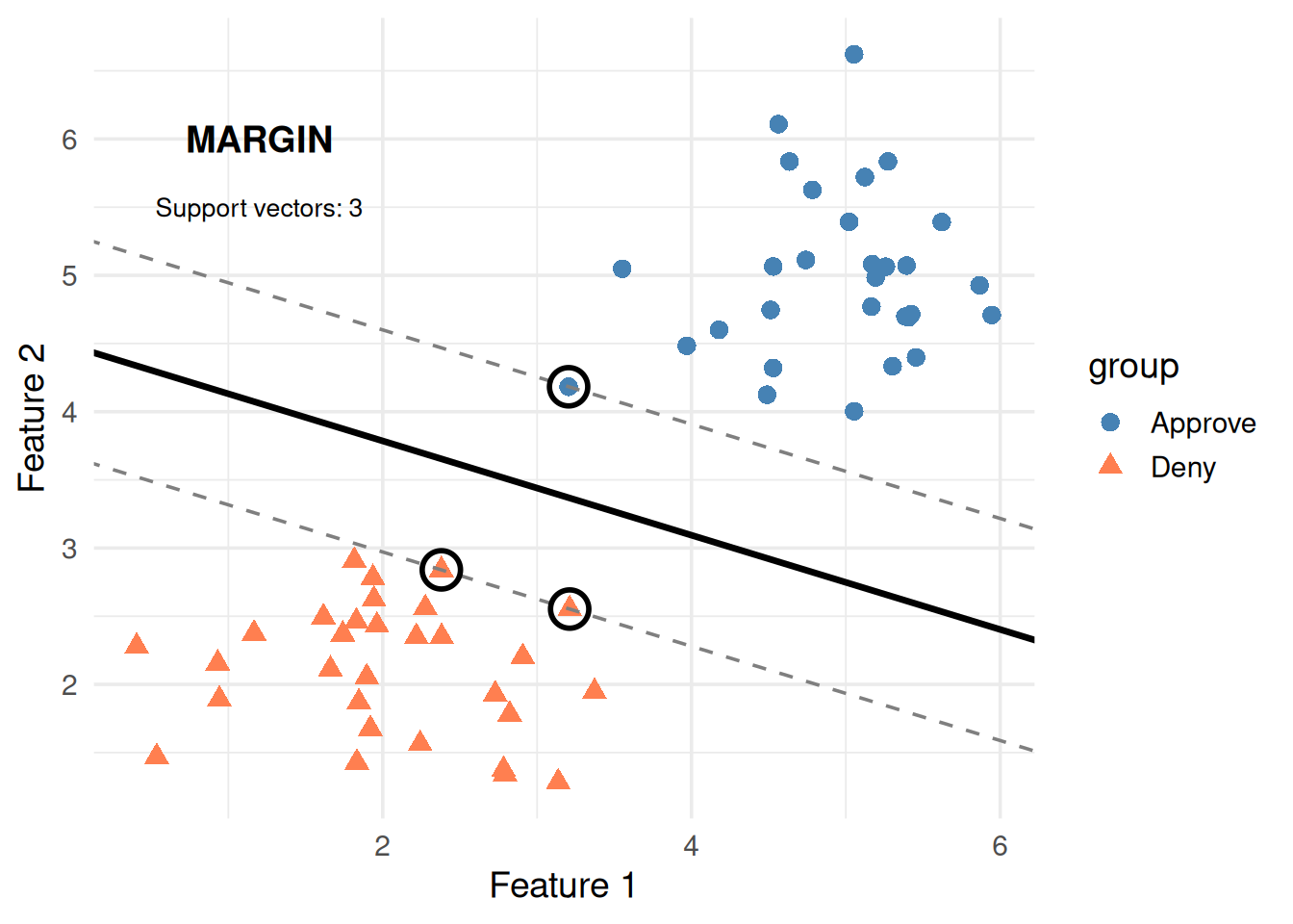
svm_fit <-svm(group ~ x1 + x2, data = df, kernel ="linear", cost =1, scale =FALSE)# Extract the weight vector and intercept from the SVM modelw_svm <-t(svm_fit$coefs) %*% svm_fit$SVb_svm <--svm_fit$rhoslope <--w_svm[1] / w_svm[2]intercept <--b_svm / w_svm[2]margin_offset <-1/ w_svm[2]sv_indices <- svm_fit$indexggplot(df, aes(x1, x2, color = group, shape = group)) +geom_point(size =3) +# Decision boundarygeom_abline(intercept = intercept, slope = slope, linewidth =1.2) +# Margin linesgeom_abline(intercept = intercept + margin_offset, slope = slope,linetype ="dashed", color ="gray50") +geom_abline(intercept = intercept - margin_offset, slope = slope,linetype ="dashed", color ="gray50") +# Circle support vectorsgeom_point(data = df[sv_indices, ], aes(x1, x2),color ="black", shape =1, size =6, stroke =1.5) +scale_color_manual(values =c("steelblue", "coral")) +annotate("text", x =1.2, y =6, label ="MARGIN", fontface ="bold", size =5) +annotate("text", x =1.2, y =5.5,label =paste0("Support vectors: ", length(sv_indices)),size =3.5) +theme_minimal(base_size =14) +labs(x ="Feature 1", y ="Feature 2")
Figure 5: The margin is the gap between the boundary and the closest points (support vectors)
The circled points are support vectors — the closest points to the boundary. They’re the only points that matter. Move any other point and the boundary stays the same. Move a support vector and the boundary shifts.
That’s why it’s called Support Vector Machine — the boundary is “supported” by these critical points.
\[y_i(\mathbf{w} \cdot \mathbf{x}_i + b) \geq 1 \quad \text{for all } i\]
Let’s unpack both parts:
The objective: \(\frac{1}{2}\|\mathbf{w}\|^2\)
We want to maximize the margin (\(\frac{2}{\|\mathbf{w}\|}\))
Maximizing \(\frac{2}{\|\mathbf{w}\|}\) is the same as minimizing \(\|\mathbf{w}\|\)
We minimize \(\frac{1}{2}\|\mathbf{w}\|^2\) instead (same answer, easier calculus — squared removes the square root, the \(\frac{1}{2}\) simplifies the derivative)
The constraint: \(y_i(\mathbf{w} \cdot \mathbf{x}_i + b) \geq 1\)
\(y_i\) is the label of point \(i\): either +1 or -1
\(\mathbf{w} \cdot \mathbf{x}_i + b\) is the “raw score” — how far point \(i\) is from the boundary
The product \(y_i \times (\text{raw score})\) is positive when the point is on the correct side
The \(\geq 1\) means every point must be at least 1 unit away from the boundary (on the correct side)
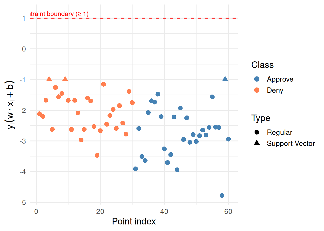
# Compute y_i * (w · x_i + b) for each pointdf$y <-ifelse(df$group =="Approve", 1, -1)df$raw_score <-as.numeric(w_svm[1] * df$x1 + w_svm[2] * df$x2 + b_svm)df$constraint <- df$y * df$raw_scoredf$is_sv <-seq_len(nrow(df)) %in% sv_indicesggplot(df, aes(x =seq_along(constraint), y = constraint,color = group, shape = is_sv)) +geom_point(size =3) +geom_hline(yintercept =1, linetype ="dashed", color ="red") +scale_color_manual(values =c("steelblue", "coral")) +scale_shape_manual(values =c(16, 17), labels =c("Regular", "Support Vector")) +annotate("text", x =5, y =1.15, label ="Constraint boundary (≥ 1)",color ="red", size =3.5) +theme_minimal(base_size =14) +labs(x ="Point index", y =expression(y[i] * (w %.% x[i] + b)),shape ="Type", color ="Class")
Figure 6: The constraint value for each point — all must be ≥ 1
Notice: support vectors sit right at the constraint boundary (value ≈ 1). They’re the tightest points. Everything else has comfortable margin.
7. Soft Margins: What If the Data Overlaps?
Real data is messy. Groups overlap. A perfect separating line might not exist. Soft margin SVM allows some points to be on the wrong side — for a penalty.
\[\min_{\mathbf{w}, b} \quad \frac{1}{2}\|\mathbf{w}\|^2 + C \sum_{i=1}^{n} \xi_i\]
New pieces:
Symbol
What it is
Plain English
\(\xi_i\) (xi)
Slack variable for point \(i\)
How much point \(i\) violates the margin
\(C\)
Cost parameter
How much we penalize violations
\(\xi_i = 0\) → point is on the correct side, outside the margin (happy)
\(0 < \xi_i < 1\) → point is on the correct side, but inside the margin (mild violation)
\(\xi_i \geq 1\) → point is on the wrong side (misclassified)
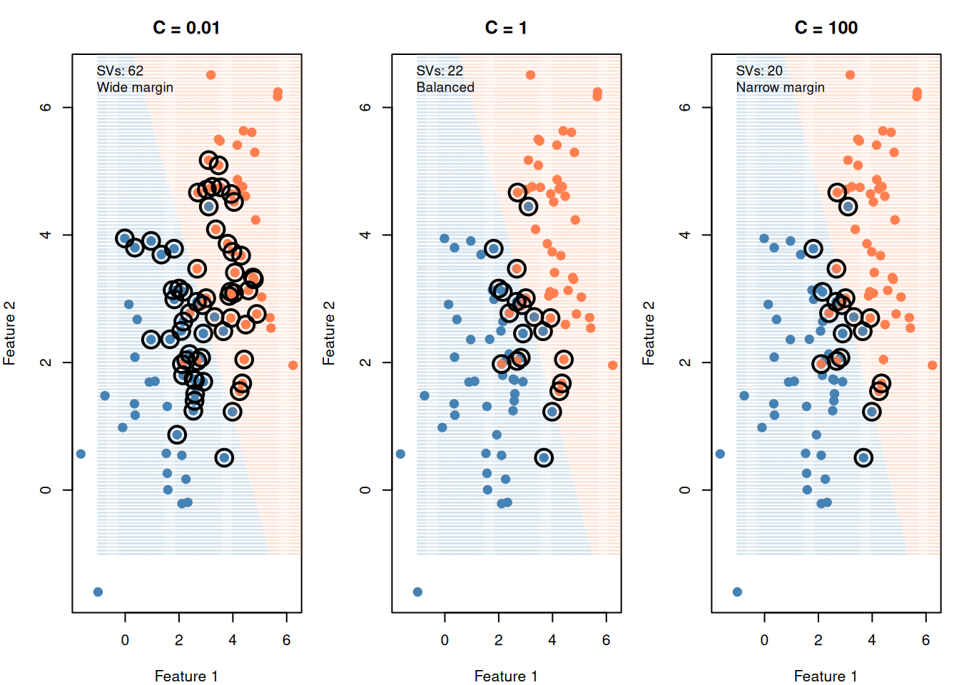
Figure 7: Small C = wide margin (some errors OK). Large C = narrow margin (few errors tolerated).
The C parameter is the most important tuning knob in SVM:
Small C (like 0.01): “I don’t care much about errors” → wide margin, many support vectors, simpler model (risk of underfitting)
Large C (like 100): “Every error is expensive” → narrow margin, few support vectors, complex model (risk of overfitting)
You choose C via cross-validation (try different values, pick the one that performs best on held-out data)
WarningTwo C Conventions — Know Which One You’re Using
R’s ksvm() / e1071 / sklearn use C as the cost of misclassification: Large C = narrow margin = overfit risk. This is what the demo above shows.
Some formulations write: \(\min \sum \max(0, \ldots) + C \sum a_j^2\) where C multiplies the regularization term (like λ). Here: Large C = wider margin = underfit risk. This is the opposite convention.
In practice: Read the formula. If C is on the regularization term (penalty on coefficients), then large C = wider margin. If C is on the error term (cost of misclassification), then large C = narrower margin. The notation will usually tell you — don’t assume one convention.
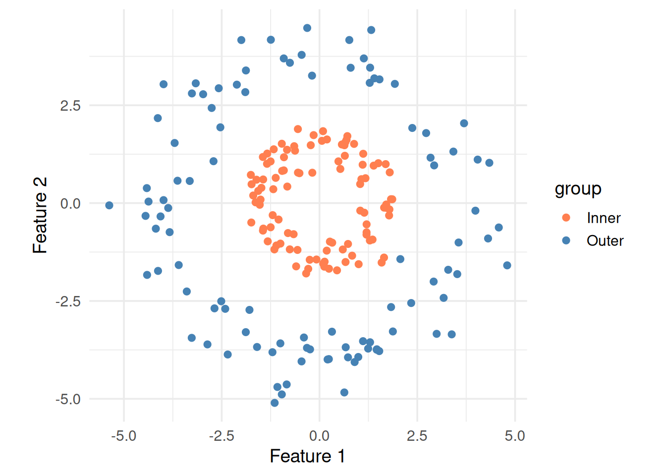
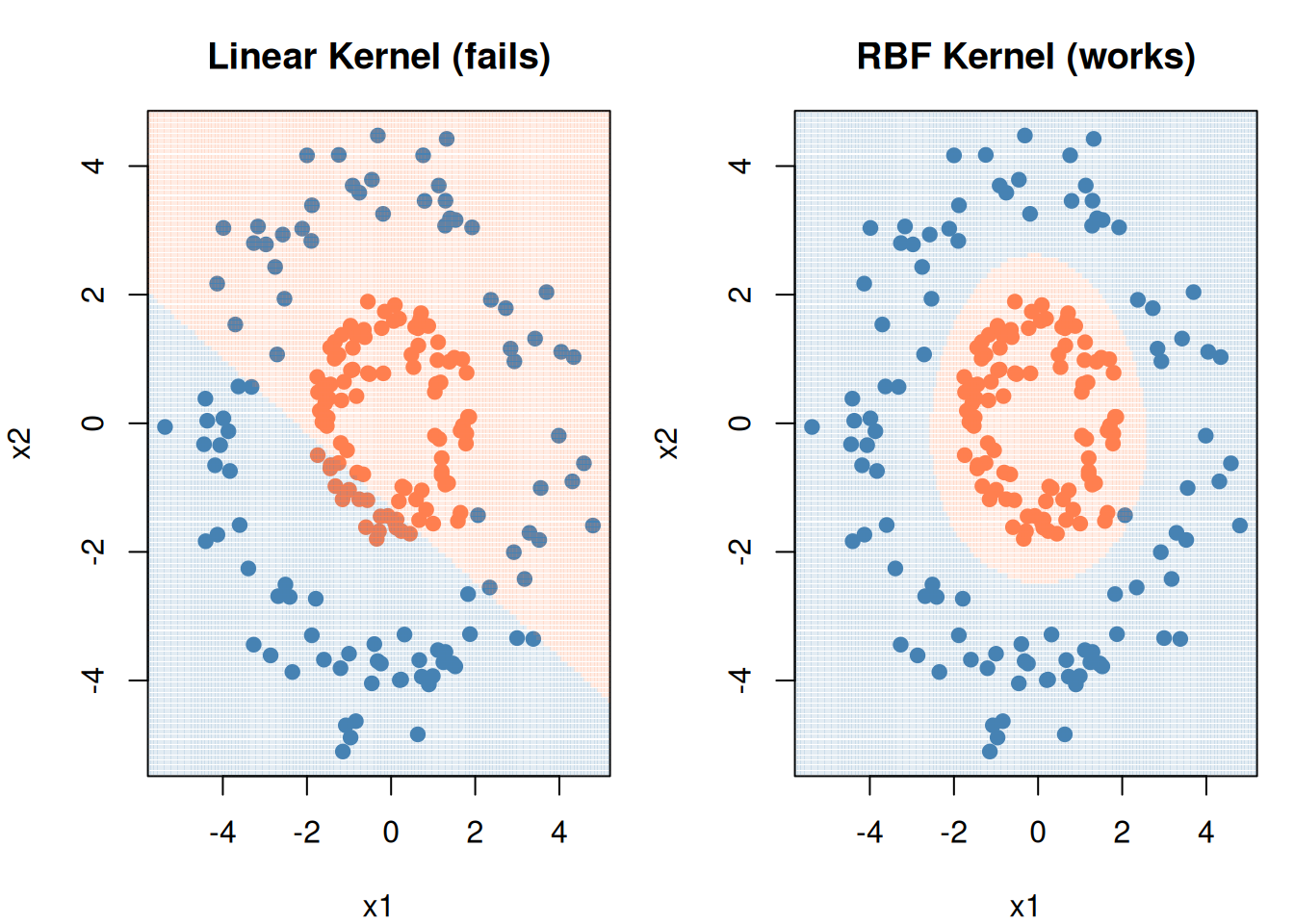
Figure 8: This data can’t be separated by any straight line
The kernel trick maps data into a higher dimension where a linear separator exists, without actually computing the transformation. It replaces the dot product \(\mathbf{x}_i \cdot \mathbf{x}_j\) with a kernel function \(K(\mathbf{x}_i, \mathbf{x}_j)\).
Figure 9: RBF kernel draws a curved boundary where linear can’t
9. Cheat Sheet: The Whole Story on One Page
THE SVM RECIPE
==============

1. GOAL: Find the boundary with the widest margin

2. FORMULA (soft margin):

   min  ½||w||²  +  C × Σξᵢ
        --------     --------
        "keep the    "penalize
         margin       errors"
         wide"

   subject to: yᵢ(w·xᵢ + b) ≥ 1 - ξᵢ

3. KEY PARAMETERS:
   C     → error tolerance  (tune via cross-validation)
   kernel → shape of boundary (linear, RBF, polynomial)
   γ     → RBF "reach"      (high γ = local, low γ = global)

4. SUPPORT VECTORS = points on the margin edge
   - Only these points define the boundary
   - More SVs = simpler/wider margin
   - Fewer SVs = tighter/narrower margin

5. ALWAYS SCALE YOUR FEATURES FIRST
   SVM uses distances — unscaled features with large ranges dominate
10. Check Your Understanding
NoteTest Yourself
Before moving on, try to answer these without scrolling up:
What does the weight vector \(\mathbf{w}\) control geometrically?
Why do we minimize \(\|\mathbf{w}\|^2\) instead of maximizing the margin directly?
What happens when you increase C? What about decreasing it?
Why are they called “support” vectors?
When would you use an RBF kernel instead of a linear one?