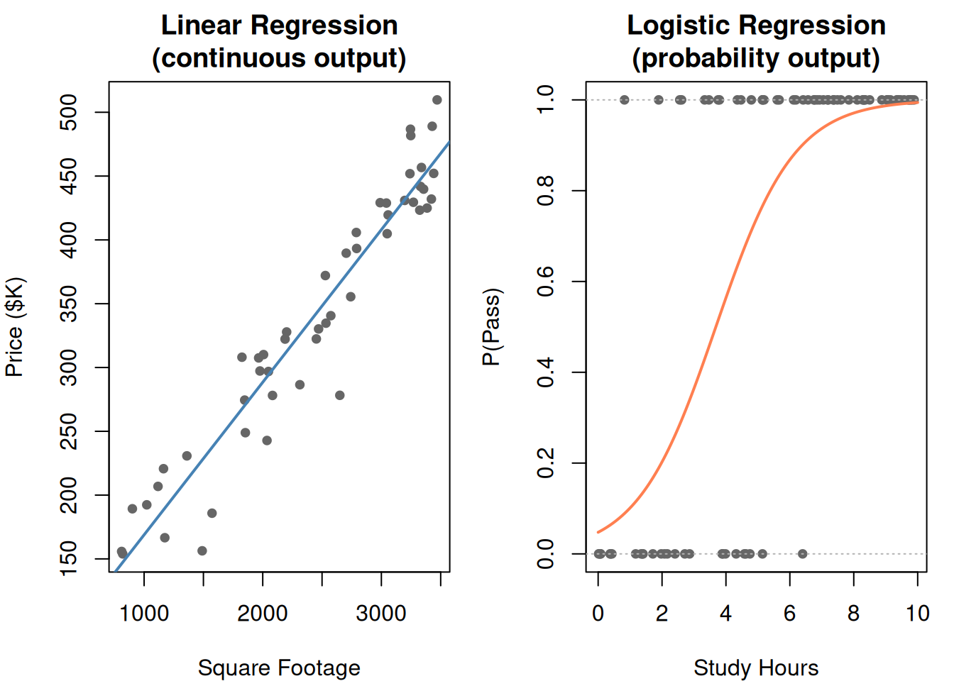
Regression From Scratch: Predicting Numbers and Understanding Relationships

Linear regression, logistic regression, and the causation trap

1. The Problem: Predict a Number

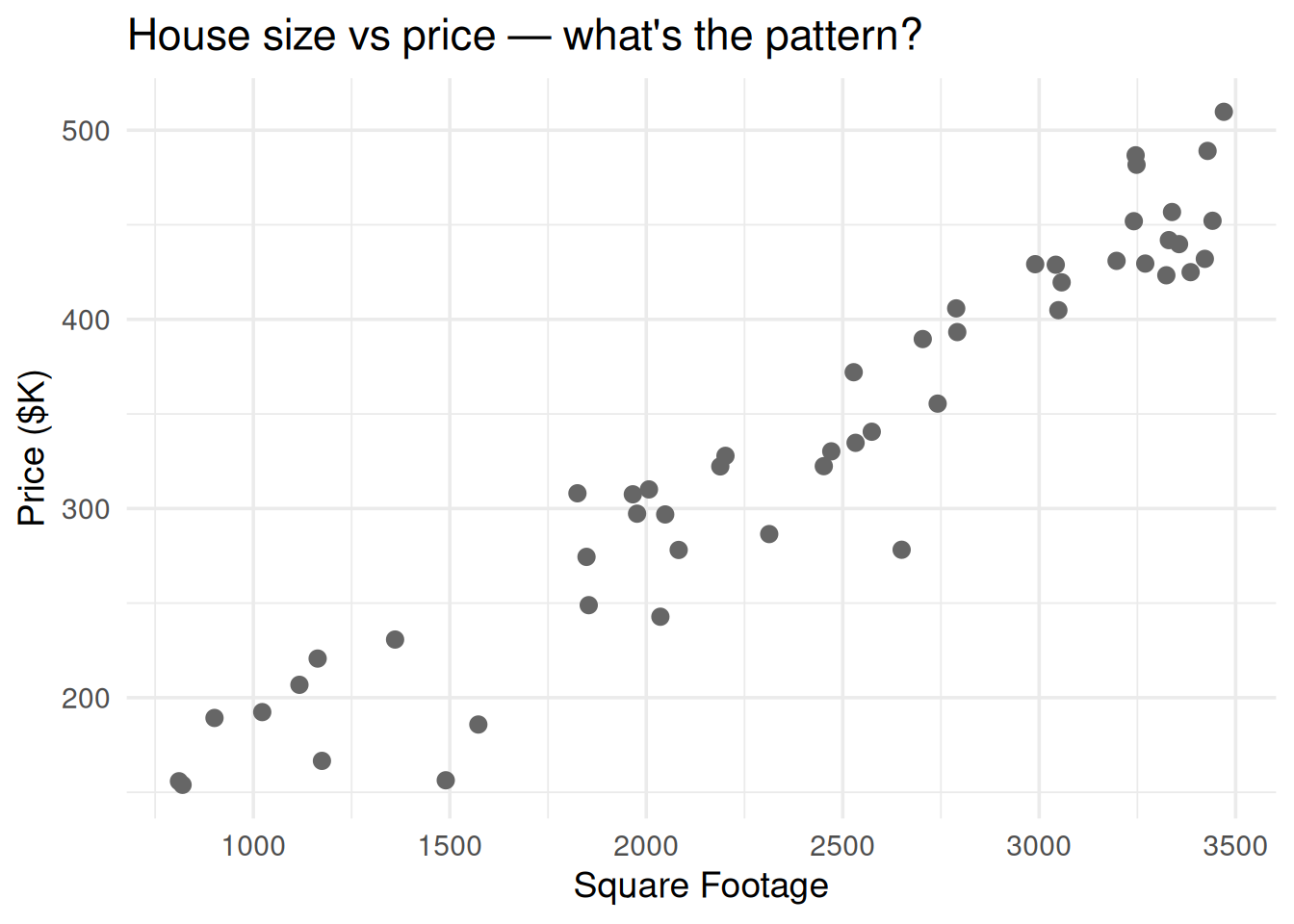
Someone gives you data: house square footage and sale price. You want to predict the price of a new house based on its size. Not a category — an actual number.

That’s regression: predict a continuous value from one or more input features.

library(ggplot2)
set.seed(42)

n <- 50
sqft <- runif(n, 800, 3500)
price <- 50 + 0.12 * sqft + rnorm(n, 0, 30)

df <- data.frame(sqft = sqft, price = price)

ggplot(df, aes(sqft, price)) +
  geom_point(size = 2.5, color = "gray40") +
  theme_minimal(base_size = 14) +
  labs(x = "Square Footage", y = "Price ($K)",
       title = "House size vs price — what's the pattern?")
Figure 1: Each dot is a house. Can you draw a line that captures the relationship?

2. The Formula: A Line Through the Data

\[y = a_0 + a_1 x_1 + \epsilon\]

Symbol What it is Plain English
\(y\) Response variable What you’re predicting (price)
\(x_1\) Predictor variable What you’re using to predict (sqft)
\(a_0\) Intercept Predicted \(y\) when \(x = 0\) (the baseline)
\(a_1\) Coefficient (slope) How much \(y\) changes per unit increase in \(x\)
\(\epsilon\) Error / residual The noise — what the line can’t explain

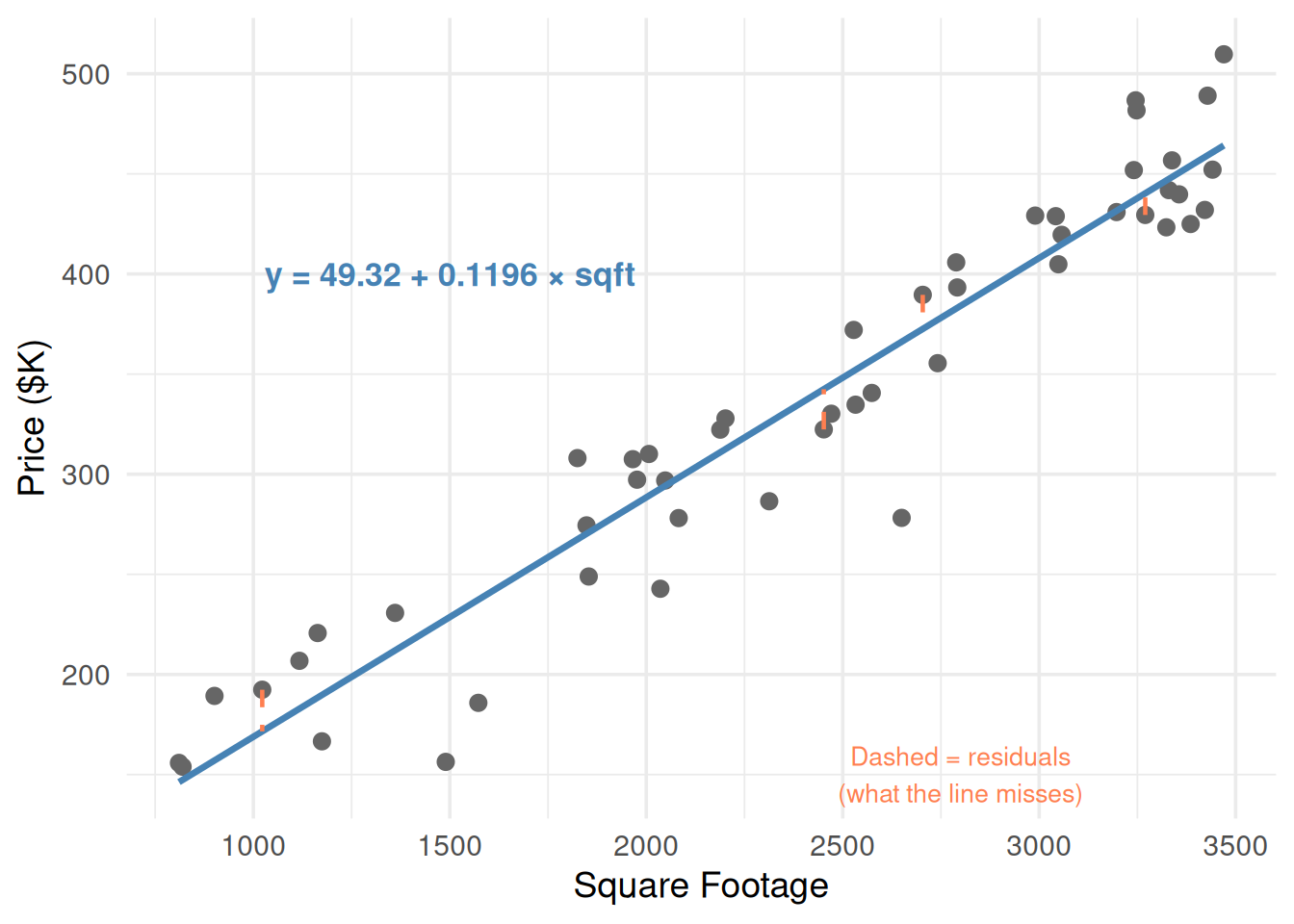
\(a_1\) is the key number. If \(a_1 = 0.12\), every extra square foot adds $120 to the predicted price.

fit <- lm(price ~ sqft, data = df)
a0 <- round(coef(fit)[1], 2)
a1 <- round(coef(fit)[2], 4)

ggplot(df, aes(sqft, price)) +
  geom_point(size = 2.5, color = "gray40") +
  geom_smooth(method = "lm", se = FALSE, color = "steelblue", linewidth = 1.2) +
  # Show residuals for a few points
  geom_segment(data = df[c(1, 10, 25, 40), ],
    aes(x = sqft, y = price,
        xend = sqft, yend = predict(fit)[c(1, 10, 25, 40)]),
    color = "coral", linetype = "dashed", linewidth = 0.8) +
  annotate("text", x = 1500, y = 400,
    label = paste0("y = ", a0, " + ", a1, " × sqft"),
    size = 4.5, fontface = "bold", color = "steelblue") +
  annotate("text", x = 2800, y = 150,
    label = "Dashed = residuals\n(what the line misses)",
    color = "coral", size = 3.5) +
  theme_minimal(base_size = 14) +
  labs(x = "Square Footage", y = "Price ($K)")
`geom_smooth()` using formula = 'y ~ x'
Figure 2: The regression line minimizes the total squared distance from points to the line

3. How the Line Is Fit: Least Squares

Regression finds the line that minimizes the sum of squared residuals:

\[\min_{a_0, a_1} \sum_{i=1}^{n} (y_i - \hat{y}_i)^2 = \min \sum_{i=1}^{n} (y_i - a_0 - a_1 x_i)^2\]

Symbol What it is
\(y_i\) Actual value of point \(i\)
\(\hat{y}_i\) Predicted value (\(a_0 + a_1 x_i\))
\(y_i - \hat{y}_i\) Residual (error) for point \(i\)

Why squared? Squaring does two things: it makes all errors positive (so they don’t cancel out) and it penalizes big errors more than small ones.
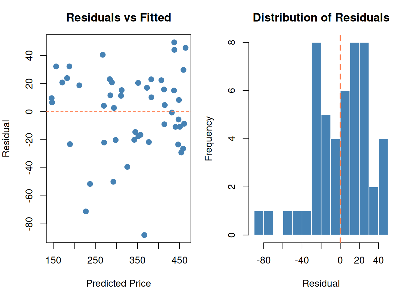
df$predicted <- predict(fit)
df$residual <- df$price - df$predicted

par(mfrow = c(1, 2), mar = c(4, 4, 3, 1))

# Residual plot
plot(df$predicted, df$residual,
  pch = 19, col = "steelblue", cex = 1.2,
  main = "Residuals vs Fitted",
  xlab = "Predicted Price", ylab = "Residual")
abline(h = 0, lty = 2, col = "coral")

# Residual histogram
hist(df$residual, breaks = 12, col = "steelblue", border = "white",
  main = "Distribution of Residuals",
  xlab = "Residual")
abline(v = 0, col = "coral", lwd = 2, lty = 2)

par(mfrow = c(1, 1))
Figure 3: Residuals = actual minus predicted. We minimize the sum of their squares.

Good residuals should be:

  • Centered at zero (no systematic over/under-prediction)
  • Randomly scattered (no pattern in the residual plot)
  • Roughly normal (bell-shaped histogram)

If you see a curve in the residual plot → your model is missing a non-linear relationship. If you see a funnel shape → the variance isn’t constant (heteroscedasticity → Box-Cox, Module 9).
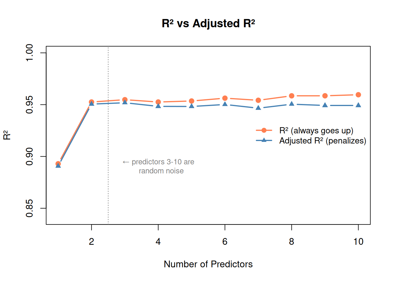
4. Multiple Regression: More Than One Predictor

Real predictions use many features:

\[y = a_0 + a_1 x_1 + a_2 x_2 + \dots + a_m x_m + \epsilon\]

set.seed(42)
bedrooms <- sample(1:5, n, replace = TRUE)
price2 <- 30 + 0.1 * sqft + 15 * bedrooms + rnorm(n, 0, 20)

df2 <- data.frame(sqft = sqft, bedrooms = bedrooms, price = price2)

fit_simple <- lm(price ~ sqft, data = df2)
fit_multi <- lm(price ~ sqft + bedrooms, data = df2)

cat("=== Simple Model (sqft only) ===\n")
=== Simple Model (sqft only) ===
cat(sprintf("  R² = %.3f\n", summary(fit_simple)$r.squared))
  R² = 0.893
cat(sprintf("  price = %.1f + %.4f × sqft\n\n", coef(fit_simple)[1], coef(fit_simple)[2]))
  price = 80.6 + 0.0969 × sqft
cat("=== Multiple Model (sqft + bedrooms) ===\n")
=== Multiple Model (sqft + bedrooms) ===
cat(sprintf("  R² = %.3f\n", summary(fit_multi)$r.squared))
  R² = 0.953
cat(sprintf("  price = %.1f + %.4f × sqft + %.1f × bedrooms\n",
  coef(fit_multi)[1], coef(fit_multi)[2], coef(fit_multi)[3]))
  price = 49.8 + 0.0917 × sqft + 14.8 × bedrooms
cat("\nInterpretation: each extra bedroom adds ~$15K, holding sqft constant")

Interpretation: each extra bedroom adds ~$15K, holding sqft constant

5. Model Quality: How Good Is Your Regression?

R-squared (\(R^2\))

\[R^2 = 1 - \frac{\text{SS}_{res}}{\text{SS}_{tot}} = 1 - \frac{\sum(y_i - \hat{y}_i)^2}{\sum(y_i - \bar{y})^2}\]

Value Meaning
\(R^2 = 0\) Model explains nothing — just predicting the mean
\(R^2 = 0.7\) Model explains 70% of the variance
\(R^2 = 1.0\) Perfect fit — every point on the line
WarningR-squared Trap

\(R^2\) always increases when you add more predictors, even useless ones. A model with 50 predictors will always have higher \(R^2\) than one with 2 — that doesn’t mean it’s better.

Adjusted R-squared

Penalizes for adding predictors. It can go down if a new predictor doesn’t help enough to justify the added complexity.

\[R^2_{adj} = 1 - \frac{(1 - R^2)(n - 1)}{n - m - 1}\]

where \(m\) = number of predictors, \(n\) = number of observations.

set.seed(42)

# Start with good predictors, then add random noise columns
base_data <- df2
r2_vals <- numeric(10)
adj_r2_vals <- numeric(10)

for (num_pred in 1:10) {
  if (num_pred <= 2) {
    formula_str <- c("sqft", "sqft + bedrooms")[num_pred]
  } else {
    # Add random noise columns
    for (j in 3:num_pred) {
      col_name <- paste0("noise", j)
      base_data[[col_name]] <- rnorm(n)
    }
    preds <- c("sqft", "bedrooms", paste0("noise", 3:num_pred))
    formula_str <- paste(preds, collapse = " + ")
  }

  fit_test <- lm(as.formula(paste("price ~", formula_str)), data = base_data)
  r2_vals[num_pred] <- summary(fit_test)$r.squared
  adj_r2_vals[num_pred] <- summary(fit_test)$adj.r.squared
}

plot(1:10, r2_vals, type = "b", pch = 19, col = "coral", lwd = 2,
  ylim = c(min(adj_r2_vals) - 0.05, 1),
  main = "R² vs Adjusted R²",
  xlab = "Number of Predictors", ylab = "R²")
lines(1:10, adj_r2_vals, type = "b", pch = 17, col = "steelblue", lwd = 2)
abline(v = 2.5, lty = 3, col = "gray50")
text(4, min(adj_r2_vals), "← predictors 3-10 are\n   random noise",
     col = "gray50", cex = 0.8)
legend("right", bty = "n",
  legend = c("R² (always goes up)", "Adjusted R² (penalizes)"),
  col = c("coral", "steelblue"), pch = c(19, 17), lwd = 2, cex = 0.9)
Figure 4: R² always goes up with more predictors. Adjusted R² reveals when they’re useless.

p-values: Is This Predictor Significant?

Each coefficient gets a p-value testing: “is this coefficient actually zero?”

  • p < 0.05: Statistically significant — this predictor likely matters
  • p > 0.05: Not significant — might be noise
# Add a useless predictor
df2$shoe_size <- rnorm(n, 10, 2)
fit_with_noise <- lm(price ~ sqft + bedrooms + shoe_size, data = df2)

summary(fit_with_noise)

Call:
lm(formula = price ~ sqft + bedrooms + shoe_size, data = df2)

Residuals:
    Min      1Q  Median      3Q     Max 
-46.764 -10.554   0.667  11.354  38.906 

Coefficients:
             Estimate Std. Error t value Pr(>|t|)    
(Intercept) 26.401459  16.501398   1.600   0.1165    
sqft         0.091714   0.003262  28.120  < 2e-16 ***
bedrooms    15.021547   1.896971   7.919  3.9e-10 ***
shoe_size    2.233498   1.319233   1.693   0.0972 .  
---
Signif. codes:  0 '***' 0.001 '**' 0.01 '*' 0.05 '.' 0.1 ' ' 1

Residual standard error: 18.33 on 46 degrees of freedom
Multiple R-squared:  0.9553,    Adjusted R-squared:  0.9524 
F-statistic:   328 on 3 and 46 DF,  p-value: < 2.2e-16

Notice: sqft and bedrooms have tiny p-values (significant). shoe_size has a large p-value (not significant — it’s random noise, as expected).

WarningSignificance vs. Magnitude

A predictor can be statistically significant (low p-value) but practically meaningless if its coefficient is tiny. Always check both significance AND magnitude.

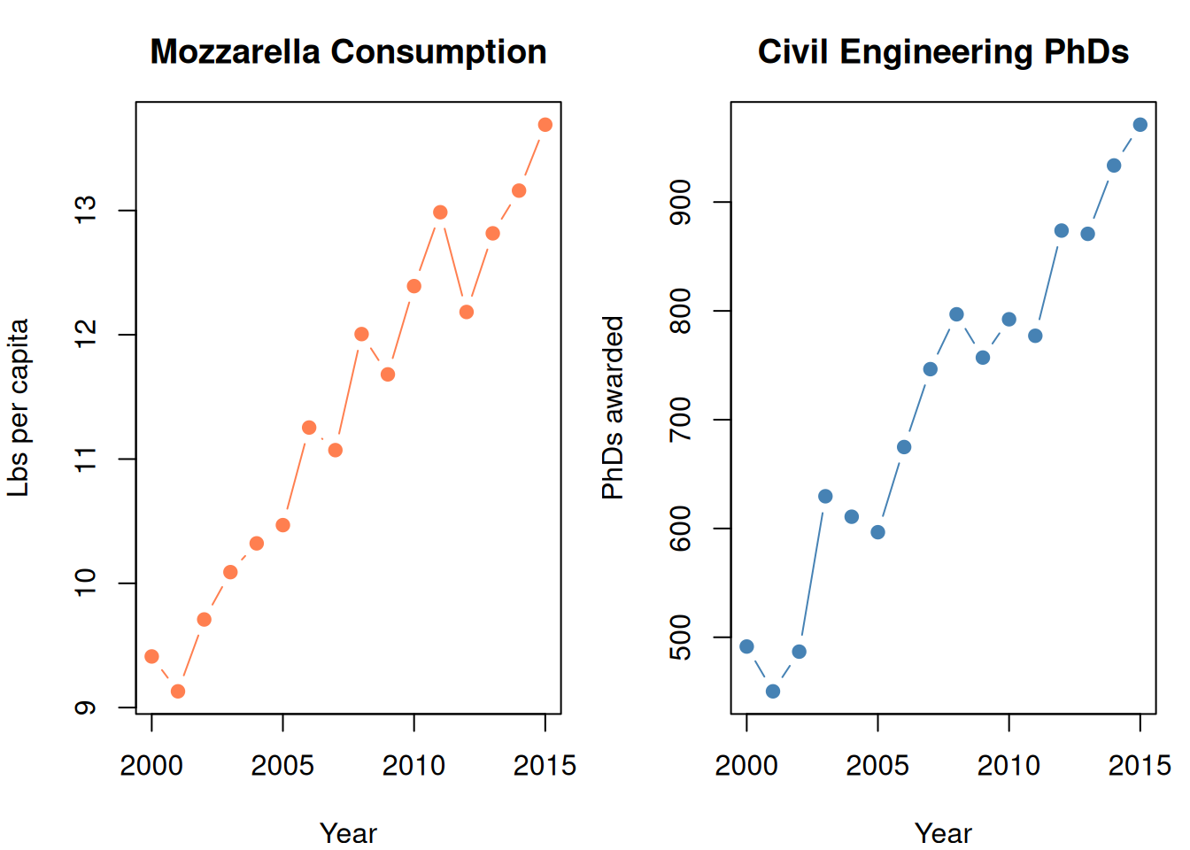
6. The #1 Common Pitfall: Correlation ≠ Causation

WarningCorrelation ≠ Causation

This is tested constantly. A regression model finds a relationship. Does that mean one thing causes the other? No.

set.seed(42)
years <- 2000:2015

# Two completely unrelated things that happen to trend upward
mozzarella <- 9 + 0.3 * (years - 2000) + rnorm(16, 0, 0.3)
phds <- 500 + 30 * (years - 2000) + rnorm(16, 0, 30)

par(mfrow = c(1, 2), mar = c(4, 4, 3, 1))

plot(years, mozzarella, type = "b", pch = 19, col = "coral",
  main = "Mozzarella Consumption",
  xlab = "Year", ylab = "Lbs per capita")

plot(years, phds, type = "b", pch = 19, col = "steelblue",
  main = "Civil Engineering PhDs",
  xlab = "Year", ylab = "PhDs awarded")

par(mfrow = c(1, 1))

cat(sprintf("Correlation: %.3f\n", cor(mozzarella, phds)))
Correlation: 0.959
cat("Highly correlated! But cheese doesn't cause PhDs.\n")
Highly correlated! But cheese doesn't cause PhDs.
cat("Both just happen to increase over time (confounding variable: time).")
Both just happen to increase over time (confounding variable: time).
Figure 5: Perfect correlation. Zero causation. Mozzarella doesn’t cause PhD awards.

What Causation Actually Requires

  1. Temporal precedence: Cause comes before effect
  2. Logical mechanism: A plausible reason WHY X would cause Y
  3. No confounding: No third variable driving both

Regression proves NONE of these. It only shows correlation.

Reasoning:

  • “The model shows X and Y are correlated” ✓
  • “X causes Y” ✗
  • “The significant coefficient means X influences Y” ✗ (it means they move together)

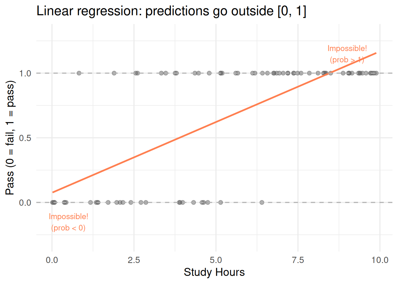
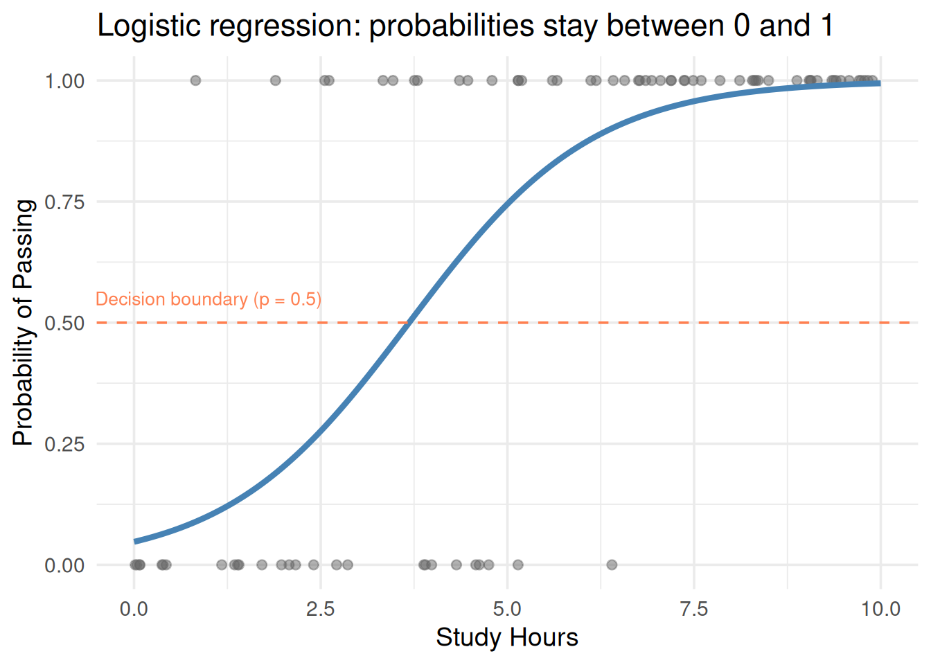
7. Transformations: When a Straight Line Isn’t Enough

Non-linear Relationships

Real data isn’t always linear. You can transform predictors to capture curves:

set.seed(42)
x <- runif(60, 1, 20)
y_nonlinear <- 5 + 3 * log(x) + rnorm(60, 0, 0.5)

df_nl <- data.frame(x = x, y = y_nonlinear)

fit_linear <- lm(y ~ x, data = df_nl)
fit_log <- lm(y ~ log(x), data = df_nl)

par(mfrow = c(1, 2), mar = c(4, 4, 3, 1))

# Linear fit (bad)
plot(x, y_nonlinear, pch = 19, col = "gray40",
  main = paste0("Linear (R² = ", round(summary(fit_linear)$r.squared, 3), ")"),
  xlab = "x", ylab = "y")
abline(fit_linear, col = "coral", lwd = 2)

# Log transform (good)
plot(x, y_nonlinear, pch = 19, col = "gray40",
  main = paste0("y ~ log(x) (R² = ", round(summary(fit_log)$r.squared, 3), ")"),
  xlab = "x", ylab = "y")
x_seq <- seq(1, 20, length.out = 100)
lines(x_seq, predict(fit_log, newdata = data.frame(x = x_seq)),
  col = "steelblue", lwd = 2)

par(mfrow = c(1, 1))
Figure 6: Transforming predictors lets linear regression fit curves

Common transformations:

Transformation When to use
\(\log(x)\) Diminishing returns (more X helps less and less)
\(x^2\) Quadratic relationship (up then down, or accelerating)
\(\sqrt{x}\) Similar to log, less aggressive
\(x_1 \cdot x_2\) Interaction — effect of \(x_1\) depends on \(x_2\)
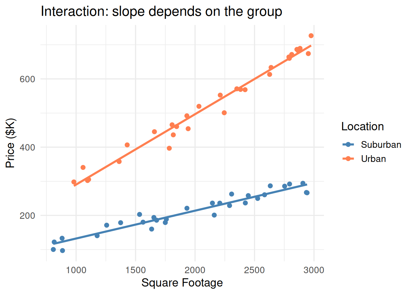
Interaction Terms

“The effect of square footage depends on the neighborhood.”

\[y = a_0 + a_1 \cdot \text{sqft} + a_2 \cdot \text{neighborhood} + a_3 \cdot (\text{sqft} \times \text{neighborhood})\]

The \(a_3\) term means the slope for sqft changes depending on the neighborhood. Without it, the model assumes sqft has the same effect everywhere.

set.seed(42)
n_int <- 60
group <- rep(c("Urban", "Suburban"), each = n_int / 2)
sqft_int <- runif(n_int, 800, 3000)
price_int <- ifelse(group == "Urban",
  100 + 0.20 * sqft_int,   # steeper slope in urban
  50 + 0.08 * sqft_int     # shallower in suburban
) + rnorm(n_int, 0, 20)

df_int <- data.frame(sqft = sqft_int, group = group, price = price_int)

ggplot(df_int, aes(sqft, price, color = group)) +
  geom_point(size = 2) +
  geom_smooth(method = "lm", se = FALSE, linewidth = 1.2) +
  scale_color_manual(values = c("steelblue", "coral")) +
  theme_minimal(base_size = 14) +
  labs(x = "Square Footage", y = "Price ($K)", color = "Location",
       title = "Interaction: slope depends on the group")
`geom_smooth()` using formula = 'y ~ x'
Figure 7: With interaction: the slope differs by group. Without: same slope forced.

8. Logistic Regression: When the Answer Is Yes or No

Linear regression predicts a number. But what if you need to predict a probability — will this customer default? Will the patient survive?

Logistic regression outputs a probability between 0 and 1.

The Problem with Linear Regression for Binary Outcomes

set.seed(42)
n_log <- 80
study_hours <- runif(n_log, 0, 10)
pass <- rbinom(n_log, 1, plogis(-3 + 0.8 * study_hours))

df_log <- data.frame(hours = study_hours, pass = pass)

ggplot(df_log, aes(hours, pass)) +
  geom_point(size = 2, alpha = 0.5, color = "gray40") +
  geom_smooth(method = "lm", se = FALSE, color = "coral", linewidth = 1,
              fullrange = TRUE) +
  geom_hline(yintercept = c(0, 1), linetype = "dashed", color = "gray70") +
  annotate("text", x = 9, y = 1.15, label = "Impossible!\n(prob > 1)",
           color = "coral", size = 3.5) +
  annotate("text", x = 0.5, y = -0.15, label = "Impossible!\n(prob < 0)",
           color = "coral", size = 3.5) +
  coord_cartesian(ylim = c(-0.3, 1.3)) +
  theme_minimal(base_size = 14) +
  labs(x = "Study Hours", y = "Pass (0 = fail, 1 = pass)",
       title = "Linear regression: predictions go outside [0, 1]")
`geom_smooth()` using formula = 'y ~ x'
Figure 8: Linear regression for yes/no data gives impossible predictions (>1 or <0)

Linear regression gives predictions above 1 and below 0 — which are meaningless as probabilities.

The Logistic Fix: The Sigmoid Function

Logistic regression wraps the linear equation inside a sigmoid (S-curve) that squishes everything into (0, 1):

\[p = \frac{1}{1 + e^{-(a_0 + a_1 x_1 + \dots)}}\]

Or equivalently, the log-odds (logit) is linear:

\[\log\left(\frac{p}{1-p}\right) = a_0 + a_1 x_1 + \dots + a_m x_m\]

Symbol What it is Plain English
\(p\) Probability of the event Chance of “yes” (0 to 1)
\(\frac{p}{1-p}\) Odds How much more likely “yes” than “no”
\(\log\left(\frac{p}{1-p}\right)\) Log-odds (logit) The thing that’s actually linear
fit_logistic <- glm(pass ~ hours, data = df_log, family = binomial)

hours_grid <- seq(0, 10, length.out = 200)
pred_prob <- predict(fit_logistic, newdata = data.frame(hours = hours_grid),
                     type = "response")

ggplot() +
  geom_point(data = df_log, aes(hours, pass), size = 2, alpha = 0.5, color = "gray40") +
  geom_line(data = data.frame(hours = hours_grid, prob = pred_prob),
            aes(hours, prob), color = "steelblue", linewidth = 1.5) +
  geom_hline(yintercept = 0.5, linetype = "dashed", color = "coral") +
  annotate("text", x = 1, y = 0.55, label = "Decision boundary (p = 0.5)",
           color = "coral", size = 3.5) +
  theme_minimal(base_size = 14) +
  labs(x = "Study Hours", y = "Probability of Passing",
       title = "Logistic regression: probabilities stay between 0 and 1")
Figure 9: The sigmoid curve: maps any number to a probability between 0 and 1

Interpreting Coefficients

In logistic regression, a coefficient \(a_j\) means: a 1-unit increase in \(x_j\) changes the log-odds by \(a_j\).

More intuitively: \(e^{a_j}\) is the odds ratio — how many times more likely the event becomes per unit increase.

summary(fit_logistic)

Call:
glm(formula = pass ~ hours, family = binomial, data = df_log)

Coefficients:
            Estimate Std. Error z value Pr(>|z|)    
(Intercept)  -2.9974     0.7881  -3.804 0.000143 ***
hours         0.8137     0.1762   4.618 3.87e-06 ***
---
Signif. codes:  0 '***' 0.001 '**' 0.01 '*' 0.05 '.' 0.1 ' ' 1

(Dispersion parameter for binomial family taken to be 1)

    Null deviance: 102.30  on 79  degrees of freedom
Residual deviance:  53.74  on 78  degrees of freedom
AIC: 57.74

Number of Fisher Scoring iterations: 6
cat(sprintf("\nOdds ratio for 'hours': %.2f", exp(coef(fit_logistic)["hours"])))

Odds ratio for 'hours': 2.26
cat("\nMeaning: each extra hour of study multiplies the odds of passing by this factor")

Meaning: each extra hour of study multiplies the odds of passing by this factor

9. Linear vs Logistic: The Practical Distinction

This distinction is easy to blur, so keep it sharp.

Linear Regression Logistic Regression
Predicts A continuous number A probability (0 to 1)
Output range \((-\infty, +\infty)\) \((0, 1)\)
Use when “Predict price/sales/temperature” “Predict probability/likelihood/yes-no”
Loss function Sum of squared errors Log-likelihood
Coefficients Change in \(y\) per unit \(x\) Change in log-odds per unit \(x\)
Example “How much will the house sell for?” “Will this loan default?”
par(mfrow = c(1, 2), mar = c(4, 4, 3, 1))

# Linear
plot(df$sqft, df$price, pch = 19, col = "gray40", cex = 0.8,
  main = "Linear Regression\n(continuous output)",
  xlab = "Square Footage", ylab = "Price ($K)")
abline(lm(price ~ sqft, data = df), col = "steelblue", lwd = 2)

# Logistic
plot(df_log$hours, df_log$pass, pch = 19, col = "gray40", cex = 0.8,
  main = "Logistic Regression\n(probability output)",
  xlab = "Study Hours", ylab = "P(Pass)")
lines(hours_grid, pred_prob, col = "coral", lwd = 2)
abline(h = c(0, 1), lty = 3, col = "gray70")

par(mfrow = c(1, 1))
Figure 10: Linear: predict a number. Logistic: predict a probability.

10. Variable Selection: Which Predictors to Include

More predictors isn’t always better. Overfitting happens when you include noise variables.

Methods to select variables:

Method How it works When to use
Adjusted \(R^2\) Pick the model with highest adj. \(R^2\) Comparing a few models
AIC Lower = better (penalizes complexity) Automated model selection
BIC Like AIC but penalizes more aggressively Want simpler models
Stepwise Add/remove predictors one at a time Exploratory
Cross-validation Test actual prediction on held-out data Gold standard

If predictors are correlated (multicollinearity): use PCA (Module 9) to create uncorrelated components, then regress on those.

11. Cheat Sheet: The Whole Story on One Page

REGRESSION RECIPE
==================

LINEAR REGRESSION
-----------------
y = a₀ + a₁x₁ + a₂x₂ + ... + ε

Fit by: minimizing Σ(yᵢ - ŷᵢ)²
Output: continuous number (-∞ to +∞)
Use when: "predict a number"

Key metrics:
  R²         → proportion of variance explained (0 to 1)
  Adj R²     → R² penalized for # predictors
  p-value    → is this predictor significant? (< 0.05 = yes)
  AIC/BIC    → compare models (lower = better)

LOGISTIC REGRESSION
-------------------
log(p/(1-p)) = a₀ + a₁x₁ + ...
p = 1 / (1 + e^(-(a₀ + a₁x₁ + ...)))

Output: probability (0 to 1)
Use when: "predict probability", "yes/no outcome"
Coefficients: change in LOG-ODDS per unit x
Odds ratio: e^(aⱼ) = how many times more likely

COMMON PITFALLS
----------
1. Correlation ≠ causation (ALWAYS)
2. High R² on training ≠ good model (need validation)
3. R² always increases with more predictors (use Adj R²)
4. Significant p-value + tiny coefficient = practically useless
5. Linear → predict number. Logistic → predict probability.
6. Check residual plot: pattern = model is wrong

TRANSFORMATIONS
  log(x), x², √x      → for non-linear relationships
  x₁ × x₂             → for interaction effects
  Box-Cox(y)           → for unequal variance (Module 9)

12. Check Your Understanding

NoteTest Yourself

Before moving on, try to answer these without scrolling up:

  1. What does linear regression minimize? Write it in words.
  2. What does \(a_1 = 0.15\) mean in price = 50 + 0.15 × sqft?
  3. Why does \(R^2\) always increase when you add predictors? Why is this a problem?
  4. You find a regression where ice cream sales predict drowning deaths (\(R^2 = 0.89\), \(p < 0.001\)). Does ice cream cause drowning? Explain.
  5. When do you use linear regression vs logistic regression?
  6. In logistic regression, what does a coefficient of 0.5 on hours mean? What’s the odds ratio?
  7. Your residual plot shows a clear U-shape. What’s wrong? How do you fix it?
  8. You add 20 random predictors and \(R^2\) goes from 0.70 to 0.85. Should you celebrate? What metric should you check instead?